Paul Roark: Black and White from Eye to Print
© Paul Roark
By Arthur H. Bleich–
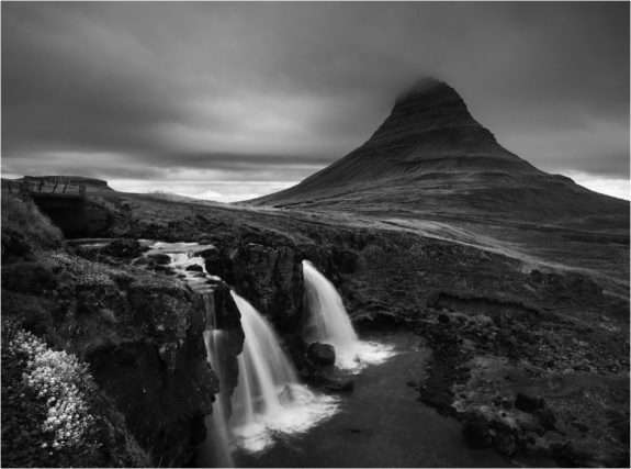
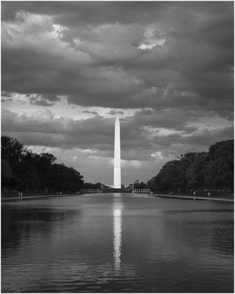
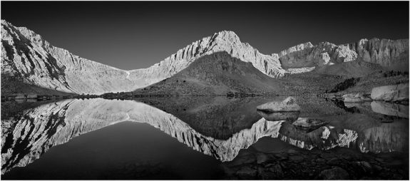
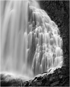
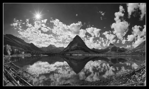
Paul Roark is one of the world’s finest black and white photographers. The tonal range of his images, printed on Red River UltraPro Satin paper virtually blow away viewers who see them for the first time and easily eclipse the best that Ansel Adams was able to achieve with analog printing.
Now 71, Roark knew photography would play an important role in his life, especially when he began to win awards for his work while still attending Hoover High in Glendale, CA. But how would he make a living at it? His father, an attorney, thought it would be difficult. His mother, and art major and teacher, encouraged him to go for it.
© Paul Roark
Arthur Bleich: So how did it work out?
Paul Roark: I decided to split my working life into two segments—one “practical” (money-making) and one where I could pursue photography as an art and not have to worry about starving. I attended UCLA Law School and then went to work as an attorney for the Federal Trade Commission. It offered excellent benefits as well as an opportunity to retire early.
AB: When did you move into full-time photography?
PR: I transitioned into it during the last 15 years of my legal career. My first big break was a one-man show at the Solvang Gallery in 1981 that turned into a traveling show around Southern California. It convinced me that black-and-white fine art landscape display prints would be my main target, although people also responded well to the color work I was doing. I suppose the strongest feedback was at a show in downtown Los Angeles where all my black-and-white prints were stolen but none of my color images.
AB: What cameras were you shooting with at that time?
PR: I had stopped using 35mm, bought a Rollei SL66 outfit and started to acquire the best medium format negatives I could, mostly saving them for printing until after I was able to transition into my photo “second life,” which happened in 1996.
AB: What are you shooting with now?
PR: I shoot with a full-frame Sony a7R which I’ve adapted to take Leica M lenses and, along with some other modifications, it can give me the quality I require for the large prints I make.
© Paul Roark
AB: Your eye for design is phenomenal. How do you go about making a great image?
PR: I go through a two-step analysis. First, the image must have impact. With color, a bright red or other color might do it. With no color to do the job, the image should have what I call a “macro pattern” that catches the viewer’s attention. We don’t notice things we don’t ‘attend’ to.
AB: And then?
PR: Once drawn to the photo, the image must keep the viewer’s interest as long as possible. I sometimes call this the “micro pattern.” Here, using relative lightness and lots of other tools, I try to keep the eye in the picture and flowing from one interesting part to another. I like a lot of information to be in the shot so there is a lot for the viewer’s brain to study and play with.
AB: Who most shaped your photographic vision?
PR: Rembrandt. His use of light and his skill at guiding the eye has always struck me as simply the best. And Brett Weston was an early favorite. And, of course as I got deeper into black-and-white and fine art silver printing, I became very familiar with Ansel Adams’ work.
© Paul Roark
AB: You are a pioneer in the field of black-and-white digital printing. How did that evolve?
PR: In the late 1990s it became very clear to me that digital was going to take over much of photography. However, achieving neutral black and white tones with a color inkset on an inkjet printer with no midtone gray inks was simply impossible. So I started to experiment with ways to control the tone of inkjet prints.
AB: It also sounds like a time-consuming challenge.
PR: Having transitioned into my photo life, I had the time and interest to promote this form of printing. Digital prints were, in my view, simply better than silver prints but there was a widespread distrust of digital prints due to the early use of dyes that faded quickly. Fade testing and careful selection of materials was critical.
AB: You obviously solved the problem?
PR: I found that a carbon-based ink that used color pigments rather than color dyes to achieve a neutral black tone would do the trick. So I became an inkset designer—not to make money—but to try to achieve a black and white digital carbon-pigment print that would be sufficiently archival to be collectible.

© Paul Roark
AB: Does this process require special printers?
PR: Not at all. Most older Epson printers are fine. In fact, I now use an Epson 7800 and 9800 for my display prints and they produce outstanding results. These old workhorses have many years of life in them when it comes to black-and-white printing. And older, smaller format printers work just as well. The biggest problem is finding refillable cartridges.
AB: Today’s high-end printers use several shades of black ink. How does their print quality compare to yours?
PR: Once you see what carbon pigment inks can produce, everything else looks second-best.
AB: What paper do you use for your carbon prints?
PR: Red River Ultra Pro Satin paper allows me to make the best, high-dynamic range B&W prints more simply than other approaches I’ve used. The quality and consistency of the paper has been outstanding. I spray my prints with Lascaux Fixativ acrylic protective spray, dry mount them, put a black wood frame around them, and they are ready to sell.
© Paul Roark
AB: You don’t use protective glass or acrylic, then?
PR: No. The lack of glass (and its reflections) greatly enhances the dynamic range and accessibility of the image to the viewer. It also cuts down on my need to deal with glass suppliers. Because I make images in sizes and proportions that fit my photographic compositions, the glass would have to be custom ordered for each image. Since I cut my own wood frame stock and do my own dry mounting, sizing the print to the composition is easy.
AB: You’ve said: “The image is king.” What point are you trying to make?
PR: That while photographers get caught up in technology or specific workflows, what makes a great black-and-white photo has not changed. Viewers are usually unaware of whether they are looking at a silver print or a carbon pigment print and most do not care. It’s the image they’re interested in.
© Paul Roark
AB: And how do you keep them interested?
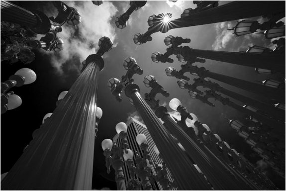
PR: Some of my scenes conjure up totally unrelated associations. I always have some abstraction in my work so the viewer must do at least a little work to fill in the blanks, but beyond this, I often like the abstractions to trigger thoughts that are totally unrelated to the subject matter—like feelings we’ve had from some past experience. One way or the other, I hope to get some involvement out of the viewer.
AB: Any final thoughts?
PR: I went into public service for my first career and I’m still there in some respects. Many, if not most, successful people will get to a point in their lives where giving back is very rewarding. When I was a kid, I rejected all the old sayings but in my life I have learned that many of them are true. You do, it seems, get what you give.
RESOURCES
Red River Ultra Pro Satin paper. Red River’s #1 best seller and the paper of choice for pros like Paul Roark.
Lascaux Fixativ protective spray for prints.
Paul Roark’s website. Multiple portfolios can be displayed at full screen to see the nuances of detail in each (as much as one can on a computer monitor).
Visit Paul Roark’s B&W Technical website. A plethora of technical information on inks and processes will be found here.
Read the details about how Paul photographed stunning abstracts of the Walt Disney Concert Hall in Los Angeles here.
To subscribe to Red River Paper’s newsletter, click here.
Original Publication Date: June 25, 2018
Article Last updated: June 25, 2018
Comments are closed.
Categories
About Photographers
Announcements
Back to Basics
Books and Videos
Cards and Calendars
Commentary
Contests
Displaying Images
Editing for Print
Events
Favorite Photo Locations
Featured Software
Free Stuff
Handy Hardware
How-To-Do-It
Imaging
Inks and Papers
Marketing Images
Monitors
Odds and Ends
Photo Gear and Services
Photo History
Photography
Printer Reviews
Printing
Printing Project Ideas
Red River Paper
Red River Paper Pro
RRP Newsletters
RRP Products
Scanners and Scanning
Success on Paper
Techniques
Techniques
Tips and Tricks
Webinars
Words from the Web
Workshops and Exhibits
all
Archives
March, 2024
February, 2024
January, 2024
December, 2023
November, 2023
October, 2023
September, 2023
August, 2023
May, 2023
more archive dates
archive article list


