The Appeal of Black & White Photography
By Michael Freeman–

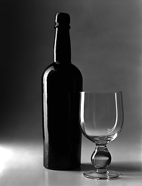
THE CHALLENGE OF SIMPLICITY. Returning to monochrome roots – even if that’s not where your photography began – offers an invigorating ability to look at everyday objects in a new light and with a fresh perspective. © Michael Freeman
There is now a significant and growing reverse flow in photography, towards the new black and white. It’s new because it’s created from colour with processing software that makes the experience a delight, which means that you don’t even need to decide at the start that it’s a black-and-white image you’re after. You can even trawl your archives with a reconsiderate eye and look for images that might work more powerfully, or at least differently, in the single range called grayscale.
So, seriously, what is this persistent appeal of black and white? There are some semi-practical answers, and a trawl of internet opinions throws up emphasis on form, shape, line and texture, as you might expect. Basically these all have the root argument that removing the distraction of colour allows you, actually compels you, to concentrate on other things. There is also the corrective argument – when the colour is somehow spoiling your idea for the shot, just switch.
However, it seems to me that there must be deeper reasons, maybe not all of them easy to pin down. In fact, the underlying appeal of black and white ought to be difficult to describe, because surely any art form that has the potential to move people must have some enigma to it. For me, then, there are four important reasons to love black and white.
1. Transcends Reality. Sounds portentous, but whilst colour is intrinsically faithful to what most people would consider visual reality – ‘this is how it looked’ – black and white jumps to another level. Not necessarily a higher level, but an alternative visual world, and in a way, a surreal one because everything in that world is seen differently from the way in which we experience it. It’s a dislocated world where you can try out different things and where no one expects you to be literal and exact.
2 Reduces. This is the more practical argument for photographers, because it affects the on-the-spot decisions of framing, composing, and so on. An interesting way of looking at this is to reverse- engineer from the often-heated arguments against colour in the years when only black and white was considered a serious pursuit, and colour was for amateurs or photographers who actually wanted to make a living wage.

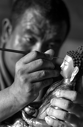
THE ESSENTIALS. This document of craftsmanship, attention to detail, and deep concentration would only be obscured by adding (or rather, reinserting) colour. © Michael Freeman
A pre-war opinion from Paul Strand that ‘it doesn’t do anything but add an uncontrollable element to a medium that’s hard enough to control anyway’ was echoed later by Cartier-Bresson, who was equally obsessed with organising the image, and wrote ‘imagine having to think about colour on top of all this’.
They, and many others, defined their faith in black and white by the difficulties in working sensitively in the opposite. This reducing argument goes as follows. It’s not just that colour has been stripped away from the visual mix so that things are somehow less complicated, but the means of making an image are simply leaner, perhaps even more pure.
And the emotional charge of colour (yes, it really affects emotion) doesn’t interfere, which means that you can get on with a different way of combining content and graphics. In other words, no cheap tricks with bright colours mixing riotously to convey cheerfulness, and somber colours doing downbeat – that kind of thing.
Expressive Range. This is partly to do with perception and partly technical: the medium of black and white has a wider stylistic and expressive range than does colour. You can go to tonal extremes without challenging people’s sense of rightness and wrongness. If you clip highlights and shadows in a colour image, it will look uncomfortably wrong to most viewers, but do the same in black and white and it’s more likely to be stark and dramatic.
Equally, a colour image that looks flat, dark, and muddy can be, in black and white, deep, and mysterious. The tradition of high-end wet darkroom printing justifies and even encourages strong and detailed tonal manipulation. Remember Ansel Adams’ idea that ‘the negative is similar to a musician’s score, and the print to the performance of that score. The negative comes to life only when ‘performed’ as a print’. The equivalent today is the Raw colour image file being interpreted as a black-and-white photograph.

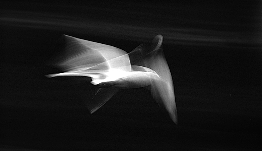
A LIGHT IN THE DARK. Particularly if the image is already impressionistic, you can push tones to places that simply wouldn’t work in colour – less becomes much more. © Michael Freeman
Legacy. Shooting in or for black and white now brings for some a comforting sense of continuity, of belonging to a tradition, maybe even with touches of nostalgia.
Ultimately, what I find fascinating is that significant numbers of photographers who grew up with colour are now picking their way along the edges of what for them is a new and intriguing world of black and white imagery – with the same fascination and questions that photographers in the 1960s and 1970s had whilst going in the opposite direction.
The big difference is that today we’re hardly likely to hear the same criticisms of vulgarity from the die-hard mainstream colourists directed at black and white as were leveled against colour in the old days. Walker Evans in 1969 said rather pompously ‘Colour tends to corrupt and absolute colour corrupts absolutely’. But then, it’s perhaps more natural to make this kind of comment as an elitist looking out toward mass culture rather than in the opposite direction.
ACKNOWLEDGEMENTS
 This excerpt from Black & White Photography:The Timeless Art of Monochrome by Michael Freeman © 2017, has been reprinted by permission of the publisher, ilex Press, a division of Octopus Publishing Group, Inc. The 192-page book is currently available from Amazon and other booksellers.
Michael Freeman is a UK professional photographer and best-selling author who has written 60 books on the practice of photography. This one covers all aspects of black and white photography and beginners through advanced photographers will find it to be a comprehensive resource to everything that monochrome has to offer.
Check out Michael Freeman’s website here.
To subscribe to Red River Paper’s newsletter, click here.
Best Photo Papers for B&W Printing.
Share your comments about this article below.
Original Publication Date: July 20, 2017
Article Last updated: July 20, 2017
Comments are closed.
Categories
About Photographers
Announcements
Back to Basics
Books and Videos
Cards and Calendars
Commentary
Contests
Displaying Images
Editing for Print
Events
Favorite Photo Locations
Featured Software
Free Stuff
Handy Hardware
How-To-Do-It
Imaging
Inks and Papers
Marketing Images
Monitors
Odds and Ends
Photo Gear and Services
Photo History
Photography
Printer Reviews
Printing
Printing Project Ideas
Red River Paper
Red River Paper Pro
RRP Newsletters
RRP Products
Scanners and Scanning
Success on Paper
Techniques
Techniques
Tips and Tricks
Webinars
Words from the Web
Workshops and Exhibits
all
Archives
March, 2024
February, 2024
January, 2024
December, 2023
November, 2023
October, 2023
September, 2023
August, 2023
May, 2023
more archive dates
archive article list


